An exit intent popup is a way of asking your visitor to join your list just before they leave your site. It gives a better user experience than a normal popup because it doesn’t interrupt your visitor’s browsing session.
In this guide to exit intent popups you’ll discover:
- what exit intent popups are
- the 4 key elements of an exit intent popup
- 39 powerful hacks for getting more subscribers from your exit intent popup
- how to use A/B testing with exit intent popups
- a list of exit intent popup providers
Let’s dive in!
- What Is An Exit Intent Popup?
- Exit Intent Conversion Rates
- 39 Exit Intent Popup Tips To Grow Your List
- #1. Match your popup to the content
- #2. Use your branding colors in the popup
- #3. Highlight the call-to-action (CTA)
- #4. Refer to your visitors’ pain points
- #5. Personalize your exit popup
- #6. Grab attention – use ‘power words’
- #7. Use action words in your button text
- #8. Be a mind reader
- #9. Use a two-step popup
- #10. Use a negative call-to-action
- #11. Use arrows
- #12. Add some urgency
- #13. Use social proof
- #14. Include a picture of the lead magnet
- #15. Use a progress bar
- #16. Stop your visitors on the way out
- #17. Hide popups from existing subscribers
- #18. Include testimonials in your exit intent popup
- #19. Be specific (people want details)
- #20. Target your offer to a specific audience
- #21. Use authority credentials
- #22. Anticipate and overcome objections
- #23. Create scarcity
- #24. Use a quiz
- #25. Make them smile
- #26. Ask their opinion
- #27. Deal with abandonment
- #28. Use limited time offers
- #29. Gather feedback
- #30. Get social media follows
- #31. Encourage app downloads
- #32. Offer discount coupons
- #33. Offer free shipping
- #34. Do a survey
- #35. Suggest related posts
- #36. Display related products or services
- #37. Use A/B testing
- #38. Use referrer detection technology
- #39. Give your visitors some choices
- Exit Intent Popup Providers
- Conclusion
- More Articles About Email Marketing
What Is An Exit Intent Popup?
An exit intent popup detects the precise moment that your visitor is about to leave your website and offers them one last opportunity to sign up to your email list.
You’re not interrupting their visit because the visitor is on their way out anyway. So, they’re far less annoying than immediate popups.
And from your point of view, your visitor is leaving anyway, so what have you got to lose?
The fact is that up to 75% of people who visit your website will never come back.
An exit intent popup is your last chance to get an email address so that you stay in touch with them. And hopefully bring them back at a later date.
Exit Intent Conversion Rates
According to Crazy Egg, craft blogger Nikki McGonigal increased her opt-in rate by a staggering 1300% by using an exit intent popup.
Other figures are more conservative. Venture Harbour, for example, estimates that an exit intent popup will increase your opt-in rate by 5% to 10%.
That’s a huge difference, admittedly. But even if the figure is closer to 10%, it’s worth installing an exit intent popup.
But what are the secrets to a successful exit intent popup?
Here are 39 exit intent popup tips to help you get more subscribers.
39 Exit Intent Popup Tips To Grow Your List
Here are 39 creative ideas for using popups to grow your mailing list.
#1. Match your popup to the content
Make sure the exit intent popup you are displaying matches the page from which your visitor is about to depart.
With blog sites in particular, a visitor will often come to your site to solve a specific problem.
They find your page through organic search, get the information they need, and leave.
Let’s say your visitor landed on a blog post about how to choose the right
They get the information they wanted and they’re about to leave when an exit intent pops up offering them an on-page SEO cheat sheet.
Are they going to be interested?
Probably not.
But what about if the popup offers a list of the best budget web hosts that offer free WordPress installation?
Now that’s an offer they’re likely to accept. Boom – you just got another subscriber to your list.
Content upgrades are a great way to target your offers to the right audience. Let’s say you write a blog post about how to build a pizza oven. Your content upgrade might be a checklist of the materials you need before you start.
Bloggers usually offer content upgrades though an inline link or a call-out box within the article itself.
But those links often don’t get seen, or the reader is busy reading the article and doesn’t want to get distracted.
But how about offering the content upgrade in an exit intent popup? After all, the reader has finished reading the article and would probably like to take away some useful information that wasn’t in the article. More about using exit intent popups for content upgrades below…
My main point here is that with exit intent popups, targeting is everything.
#2. Use your branding colors in the popup
Make sure the design of your popup is consistent with the design of your website – that way your visitor won’t feel that she has suddenly left your website.
Notice how the color scheme in this Backlinko popup is entirely consistent with the color scheme of the website:
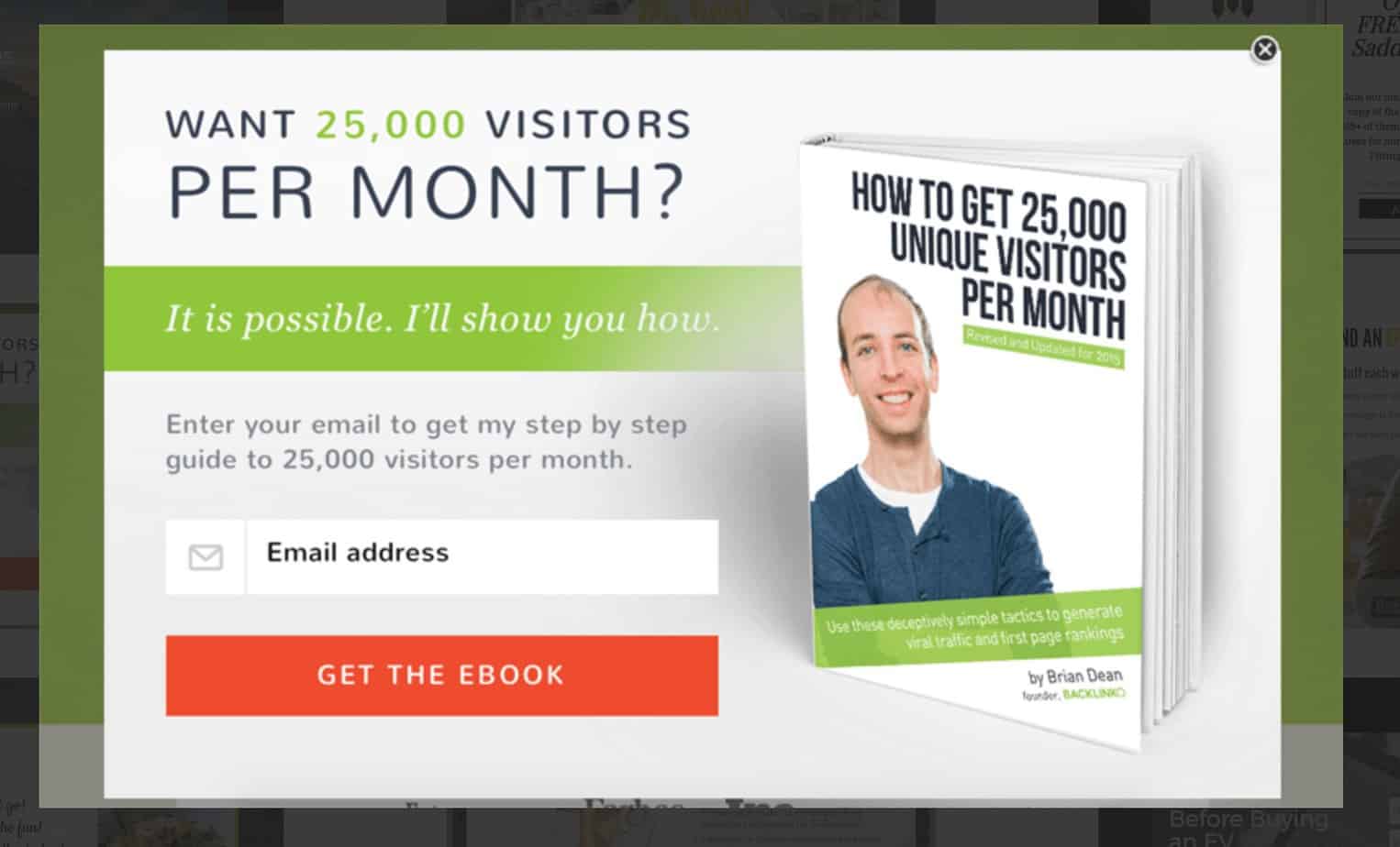
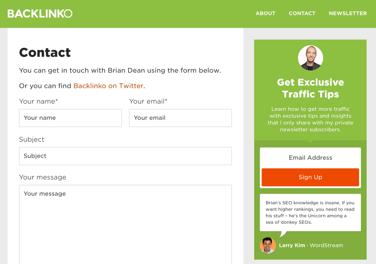
The more continuity there is between your exit intent popup and the design of your website, the higher your conversion rate will be.
If the color scheme and design elements on your exit intent popup are completely different to your website, it confuses your visitor. They may even think they’ve left your website.
Also, when the popup matches the website, it just looks more professional
Notice how the branding and the color scheme on the exit intent popup below matches the branding and color scheme on the website:
Bottom line?
Consistency in design between exit intent popup and website increases trust.
#3. Highlight the call-to-action (CTA)
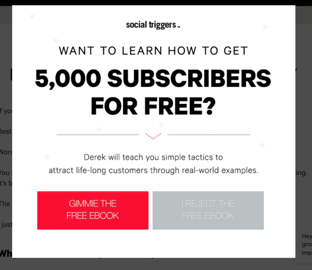
Whatever color scheme you use, make sure the Call To Action (CTA) button is the star of the show.
It should stand out so strongly that the visitor’s eye is naturally drawn to it.
Here’s an example from Derek Halpern’s Social Triggers. Notice how your eye can’t help but settle on the red button:
#4. Refer to your visitors’ pain points
The copy or message on your exit intent needs to be powerful but brief.
Remember, your visitor is already on their way out, they’re not going to stop and read a whole paragraph of text.
All you want is a bold headline and a punchy sub-head. Nothing more.
Think about your visitor’s likely pain points. They came on to the Internet to solve something:
- They need more traffic to their website
- They need a low budget recipe for a family dinner
- They don’t know where to start building a website
Whatever the case, your visitor will have a main pain point that got them searching in Google.
That’s what you need to focus on.
#5. Personalize your exit popup
Address your message to a single person – the one who’s just about to leave your site.
You don’t know their name, but you can at least use the word ‘You’ (preferably more than once).
Nothing is sweeter to your visitor than the sound of their own name.
That may not be possible.
But the next best thing is ‘You’:
- Before you leave
- Before you go
- Are you leaving already?
- You’re not leaving?
- Increase Your Traffic By 297% in the next 30 days
- Double Your Conversion Rates with this one little-known technique
- How to get your blog posts on Page #1 of Google, even when your DA is low
Another way to personalize your exit intent popups is to use referrer detection technology.
Let’s say you’ve written a guest post on SmartBlogger. Using OptinMonster’s Referral Detection, you can target people coming to your site from that guest post with a message like this: ‘Hey SmartBlogger Readers – a special offer just for you!”
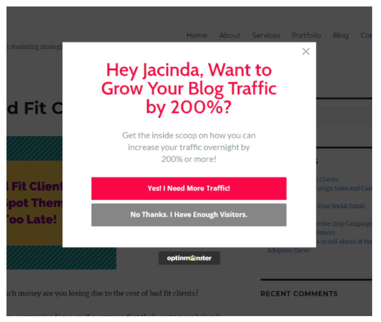
The ultimate way to personalize your exit intent popups is with dynamic text replacement.
For example, with OptinMonster’s Dynamic Test Replacement API, the software looks on your visitor’s computer for matching predefined variables (contained in things like cookies) and as soon as it finds a matching variable, it inserts the variable into your message.
Here’s an example:
#6. Grab attention – use ‘power words’
Use words that stop people in their tracks, such as:
- Wait
- Don’t Go
- Free
- Only Now
- For a Short Time
- Reserve your spot now
- Act quickly or you might lose it
- Click here to get free shipping
- Get yours now
- For a short time only
#7. Use action words in your button text
The CTA button needs to stand out visually, but it should also contain some powerful action words, such as:
- Act Now!
- Add to Cart
- Book a Demo
- Buy Now
- Claim Your Free Trial
- Click Here To Get Started!
- Click here to get X
- Continue
- Create Account
- Discover
- Download Now!
- Enter Now
- Explore
- FREE quote today
- Free Updates
- Get Started
- Get X% Off
- Gimme Now!
- Give X a try
- Instant Access!
- Join Free
- Learn More
- Order now!
- Send It To Me Now!
- Shop Now
- Show Me How
- Sign Me Up!
- Sign Up Free
- Tri It Free
- Try for Free
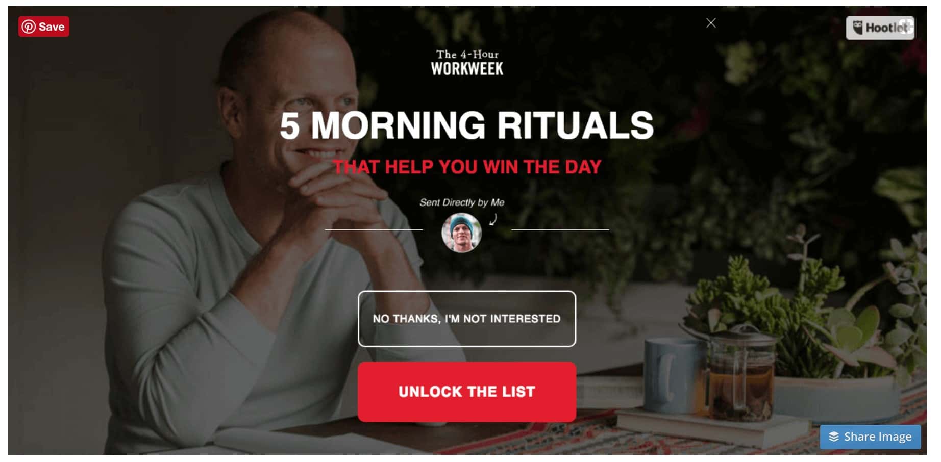
- Unlock The List
The most effective button CTAs include a strong action word, as in this example from Tim Ferris’ 4-Hour Work Week:
When creating a CTA for your exit opt-in button, remember that the message on the button should include the benefit.
Whatever you do, avoid the word ‘subscribe’. Use ‘join’ instead – it sounds much more enticing.
#8. Be a mind reader
Although exit intent popups have multiple uses, the most popular by far is gathering email addresses.
Otherwise known as list-building.
Here are 25 ways to get more email subscribers form your exit intent popup.
An exit intent popup is activated when your visitor moves their cursor towards the back arrow at the top of browser screen.
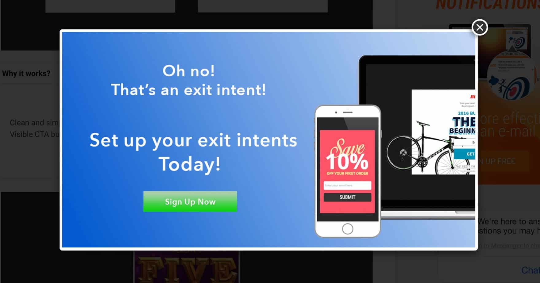
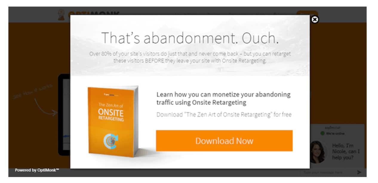
One way to grab their attention is to use a headline that makes it seem you know what they’re about to do.
Here are some examples:
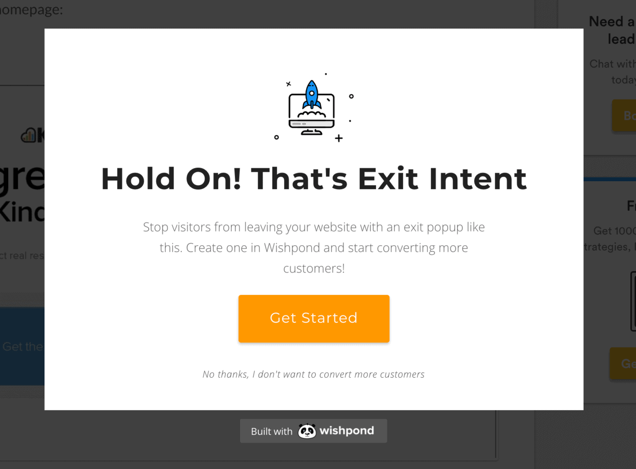
Here are some variations on this type of exit intent headline:
- What’s the Rush?
- Before You Go…
- Sorry to see you go
- Leaving Already?
- Wait, don’t leave empty-handed
- That’s called abandonment
#9. Use a two-step popup
A lot of webmasters report very high conversion rates using Two-Step Exit Intent Popups.
Why do they work so well?
Because they take advantage of a little-known aspect of human psychology.
It’s called the theory of micro-commitments. Basically, we’re you’re more likely to do something that represents a big commitment (entering an email address in an opt-in form) if you’ve already completed an action that involved a small commitment (clicking a button).
This is what a Two-Step opt-in does – it first invites the visitor to click on a button with a compelling Call To Action.
And then, on the next screen, it presents the visitor with an opt-in form.
Much more effective than presenting them with an opt-in form right away.
The visitor builds up momentum with the first step, so when the second step comes, it’s that much easier to complete.
Here’s an example of a Two-Step opt-in. The first popup simply invites you to click a button:
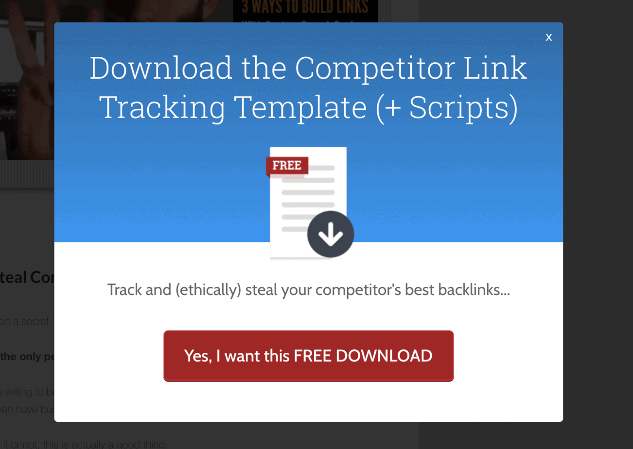
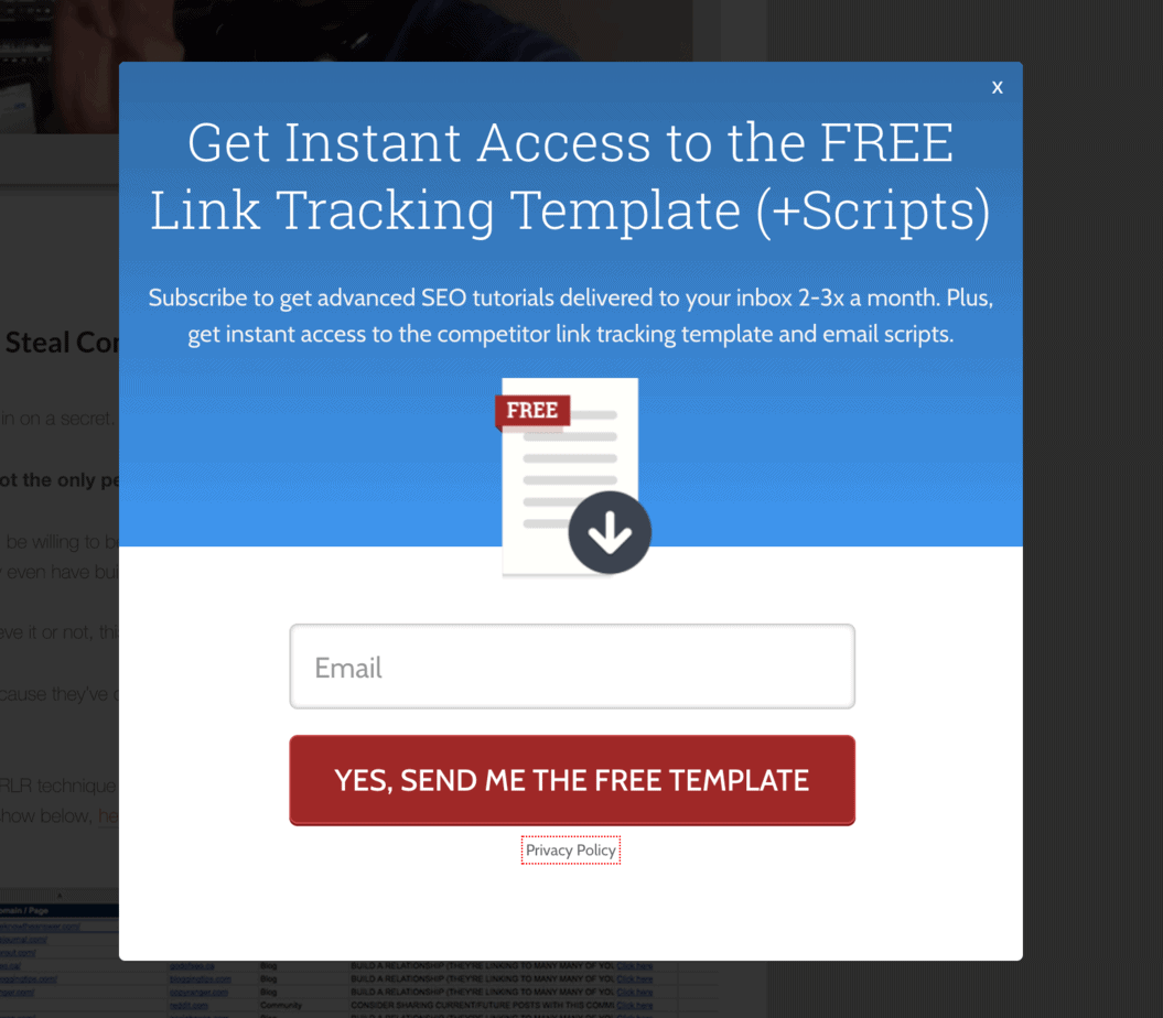
Only on the second popup are you asked to enter an email address.
And because you’ve already answered ‘Yes’ on the first popup, you’re much more likely to carry through and complete the conversion:
One popular version of the Two-Step exit intent is the ‘Yes/No’ exit intent popup.
First you get a choice between a ‘Yes’ button and ‘No’ button (in this case ‘I want the book’ and ‘I don’t want the book’):

And only then do you see an opt-in form:
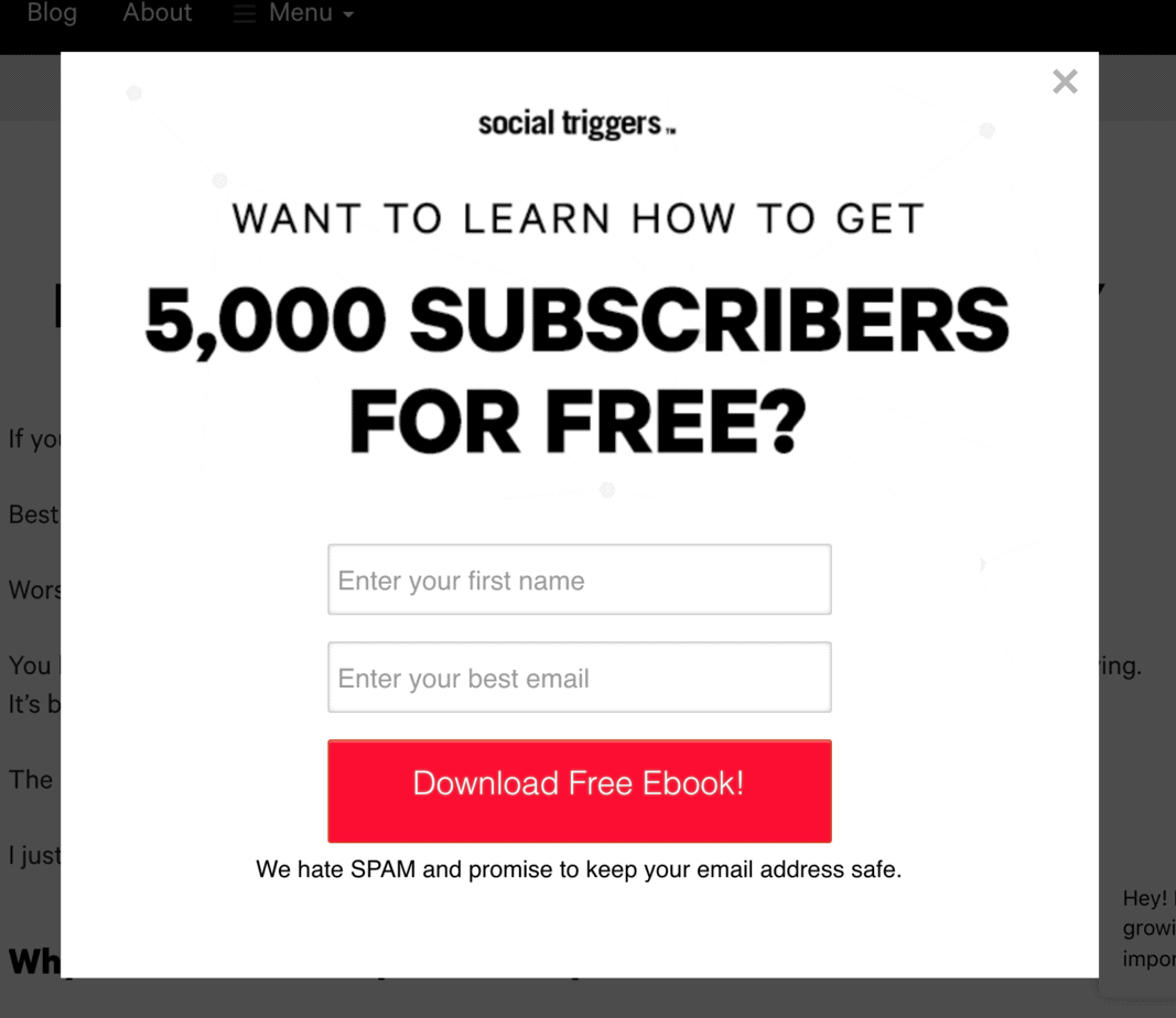
The theory of micro-commitments says that because you’ve already clicked ‘Yes’ you’re far more likely to keep going and fill out the form.
#10. Use a negative call-to-action
Two-step opt-ins often use negative CTA, which has become a bit of an art form.
Some people detest these negative buttons.
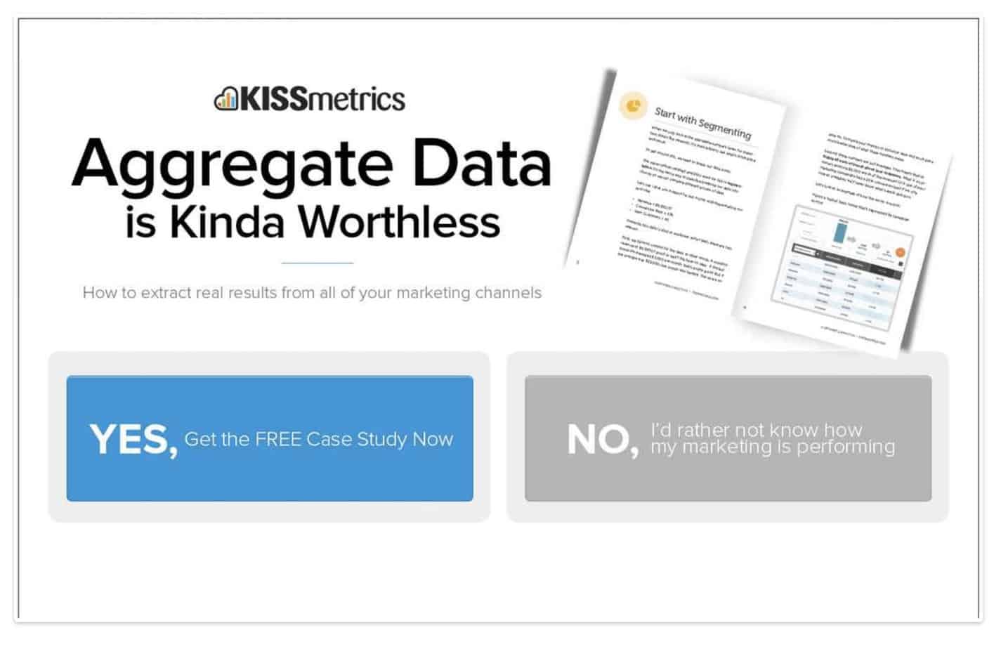
But they work, because in order to click the button you have to internalize a message that you don’t agree with, such as ‘No, I don’t want more traffic’ or ‘No, I don’t want to save money’.
Here’s an example from Kissmetrics. Notice how this popup uses psychology in the colors of the buttons – the ‘Yes’ is bright and welcoming, the ‘No’ is grey and dreary:
Here are some other examples of negative CTA that you can use on the ‘No’ button of a two-step opt-in:
- No, I don’t need a strategy
- No, I don’t need more traffic
- No, I don’t want to improve my search rankings
- No, I don’t want to save money
- No, I don’t want to reduce my bounce rate
- No, I don’t want to convert more customers
- No, I Reject the Free eBook
- No, thanks, I’d rather learn the hard way
- No, I’d rather not receive free deals in my inbox
#11. Use arrows
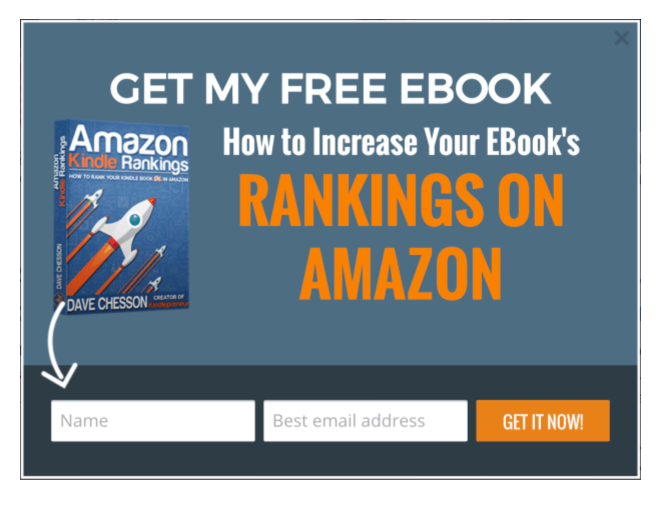
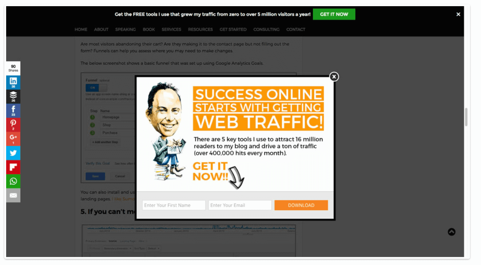
Arrows are a very effective way of making your visitor focus on what it is you want them to do.
Here’s an example from Dave Chesson’s Kindlepreneur:
And here’s another example, from Jeff Bullas:
#12. Add some urgency
One of the biggest reasons people don’t take action is that there was no clear reason why they should do it now.
That’s why a sense of urgency can dramatically increase your conversion rates.
But be careful with this one: if your visitors detect that you are simply manipulating them, this tactic will backfire on you.
For example, if you have a deadline that keeps rolling over endlessly, that’s obviously fake. And your visitors will realize that.
There’s a plant nursery near my house and they used to have a ‘closing down sale’ sign on the highway. The problem was that the sign was there for three whole years! Obviously, they’re not closing down.
That kind of thing puts people off and removes any trust in you they might have had.
A countdown timer is a good way to create urgency.
Here’s an example:
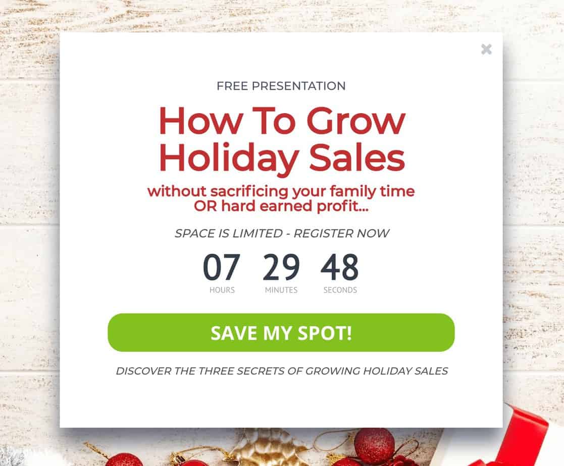
If you do use a countdown timer, just make sure that when the time expires, it’s for real – the sale is over.
Most providers of exit intent popups offer countdown timers.
Of course, you don’t have to mention time frames to create urgency. Any of these phrases create a sense of urgency:
- Book Now
- Order Now
- Get It Now
- Call Now
#13. Use social proof
Social proof is a key part of establishing your credentials.
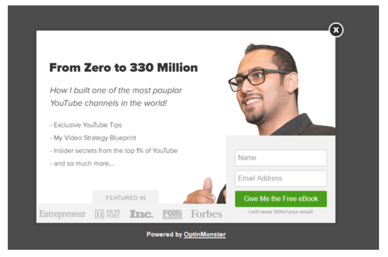
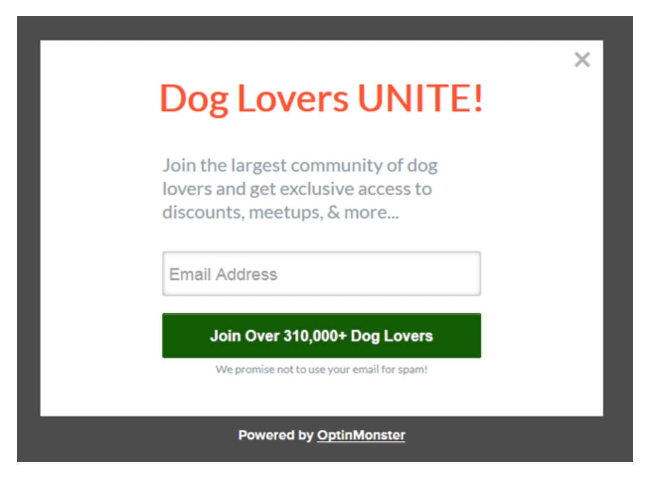
If you have a big list, state exactly how many subscribers you have: “Join 27,000 other Bloggers and receive my latest tips and techniques”.
Have you had guest posts published on major blogs? Add their logos to your exit intent popup, with the words ‘featured on’.
This exit intent popup, from Sayed Balkhi, manages to incorporate both kinds of social proof:
This exit intent popup places the social proof on the button itself:
#14. Include a picture of the lead magnet
Pictures grab people’s attention more than words. Include a high-quality image of your product:
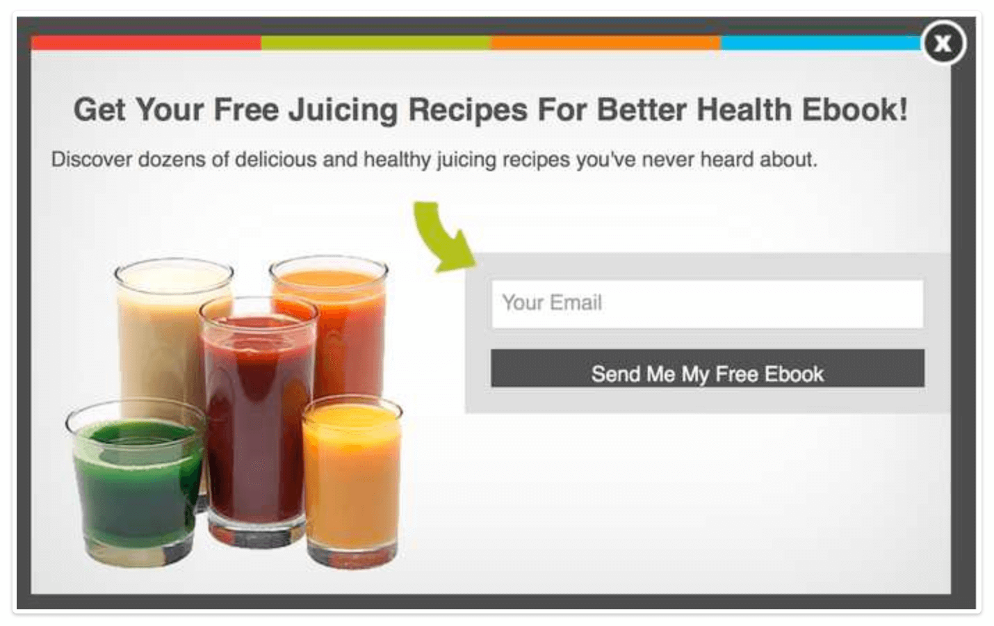
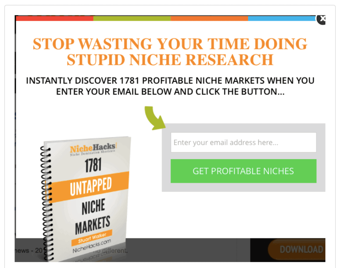
Not only will it grab your visitor’s attention, it increases the perceived value of your product.
Notice how the book covers on these two exit intents (from Backlinko) pop off the screen and grab your attention:

#15. Use a progress bar
The Zeigarnik Effect is a tendency we all have to want to complete things. We humans don’t like to leave things incomplete.
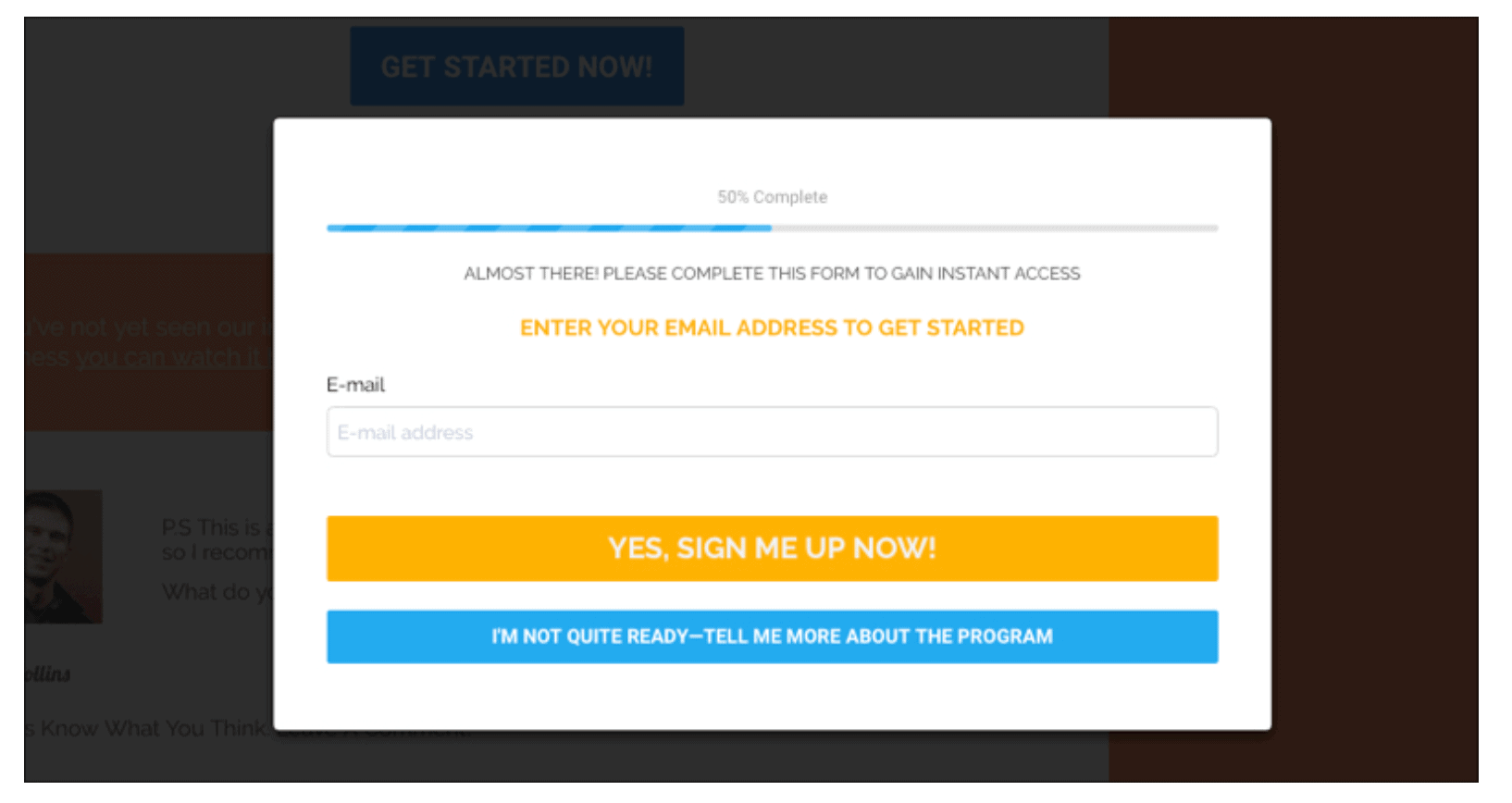
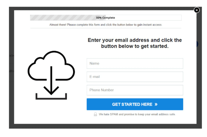
And that’s why progress bars are so effective in exit intent popups. They create in the visitor a sense of an unfinished process. That sense of something being unfinished creates tension in the visitor. So, they take an action (filling in the form) that will complete the process.
Here are some examples of progress bars in exit intent popups:
#16. Stop your visitors on the way out
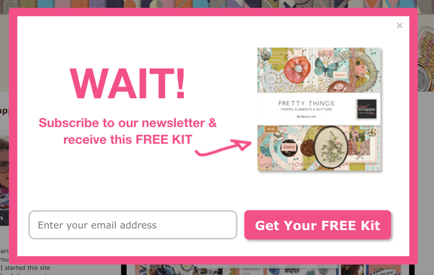
‘Wait’ is one of the most powerful words in the English language. It has the impact of ‘stop’ but much more.
Because it strongly suggests: “I’ve got something I want to show you”:
#17. Hide popups from existing subscribers
One of the drawbacks of using any kind of popup, even an exit intent, is that some people find them very annoying.
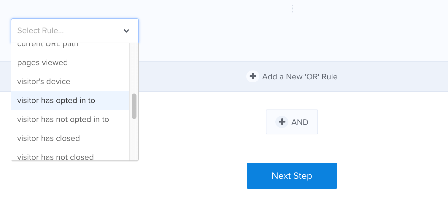
You can minimize this annoyance factor by making sure your exit intent popup does not display to people who have already subscribed to your list.
In OptinMonster, just go to the ‘Display Rules’ for your exit intent popup and add a rule to hide the popup from visitors who have already opted in:
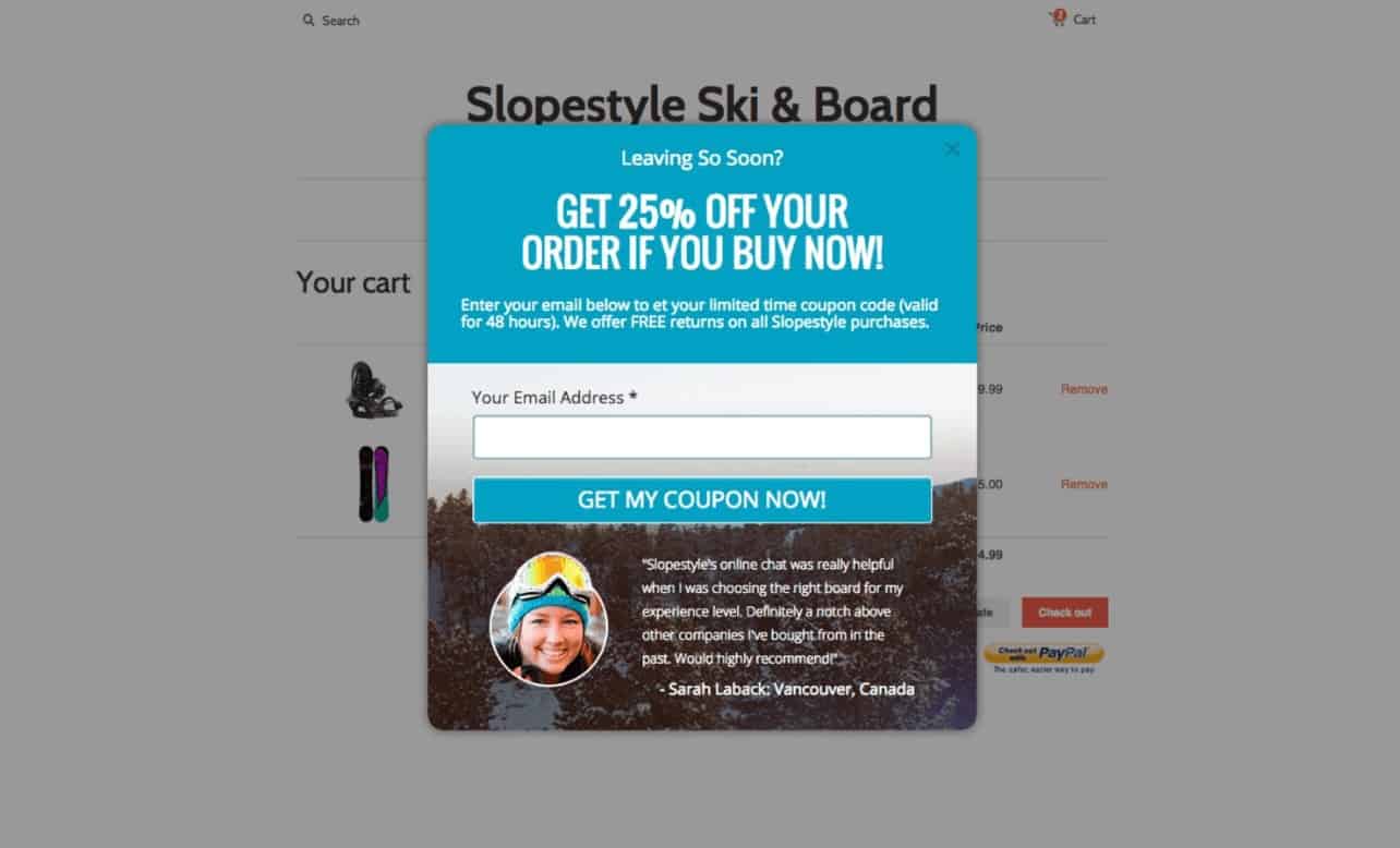
#18. Include testimonials in your exit intent popup
Testimonials are a powerful way of establishing credibility.
And they’re just as effective on exit intent popups as they are on your website.
Here’s an example:
#19. Be specific (people want details)
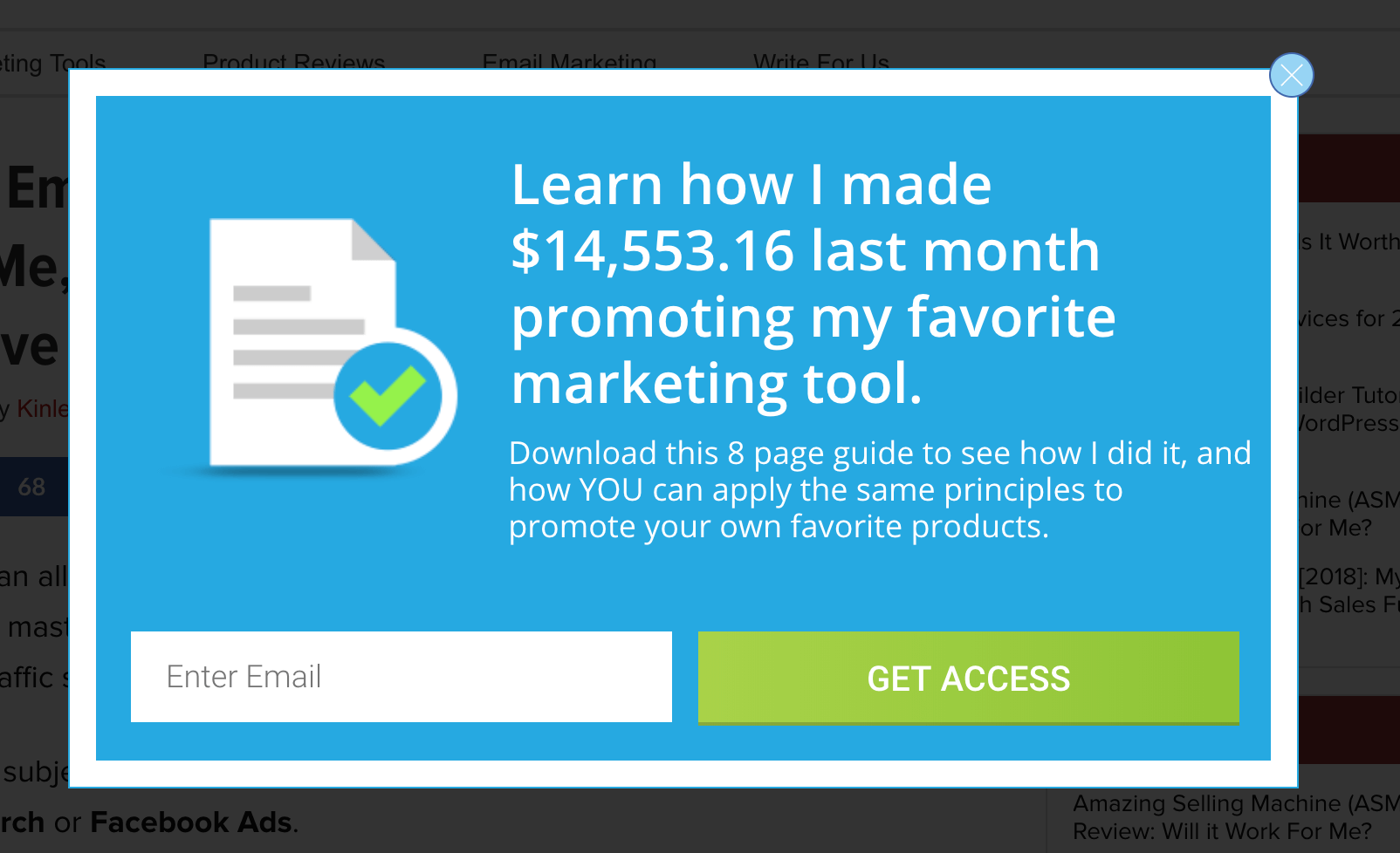
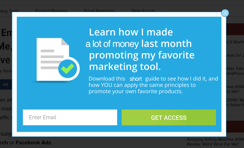
One of the reasons numbers work so well in headlines is that people want details.
Which is more attention-grabbing? The one on the left or the one on the right?
#20. Target your offer to a specific audience
Your exit intent popups will convert much better if you customize them according to the content that your visitor has just been reading.
Let’s say your exit intent popup offers a checklist of on-page SEO factors.
And let’s say your visitor found your site by searching in Google for an article about email marketing.
And let’s say she just spent the last 10 minutes reading an article on your website about email marketing.
How is she going to respond to an exit popup about on-page SEO?
Not very well. Most likely she’ll click away from the popup and keep going.
But what if your exit intent popup offers a cheat sheet of do’s and don’ts in email marketing?
She’ll be most interested! And will probably sign up to get it.
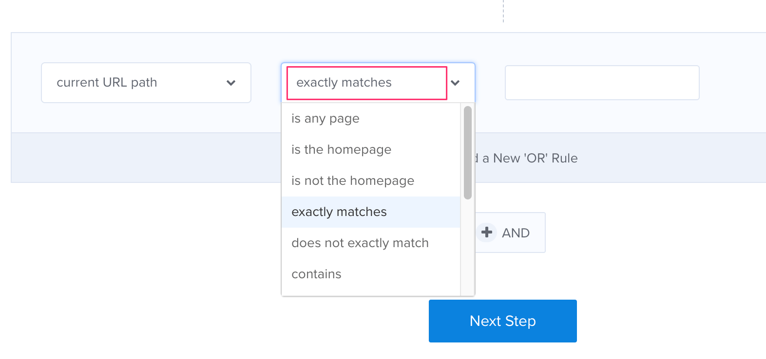
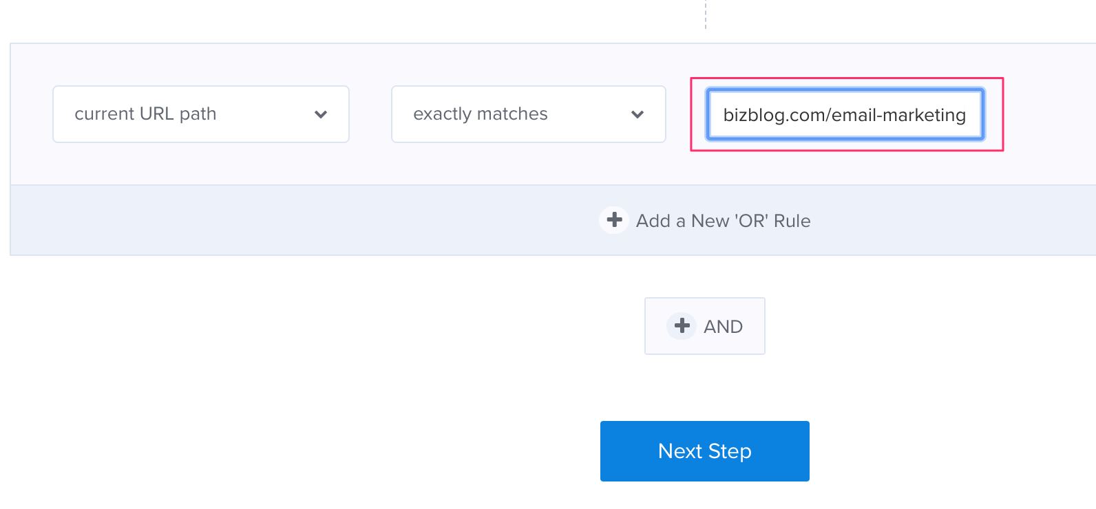
Here’s how to set an exit intent to appear only on a specific page, in OptinMonster.
First choose the primary operator (‘current URL path’):
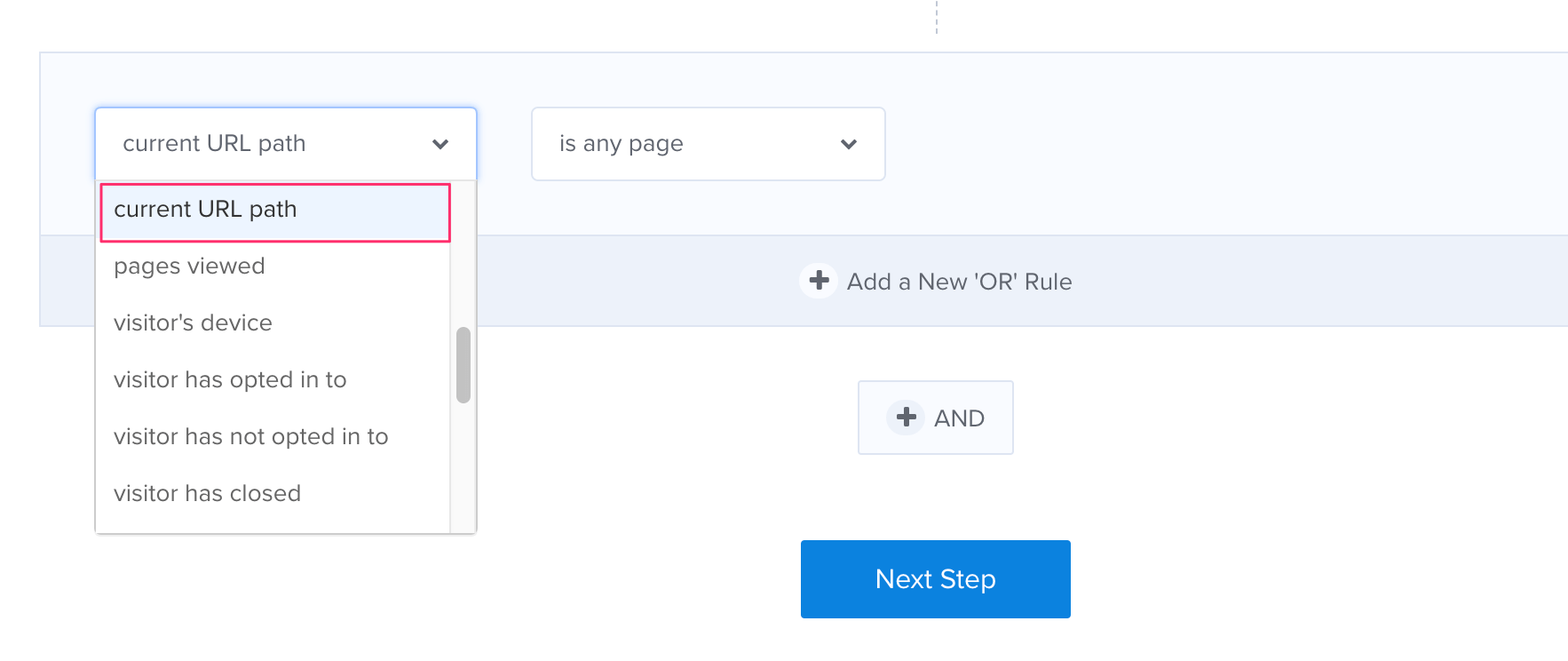
Next, choose the ‘exactly matches’ condition:
Finally, enter the URL of the page you want the exit intent popup to appear on:
#21. Use authority credentials
Do you have a qualification related to the product or service you’re offering?
If so, include it on your exit intent popup – it’ll help to establish your credibility, as in this example from Timothy Sykes:

#22. Anticipate and overcome objections
The most common buyer objections preventing some making a purchase are:
- I can get the same results on my own
- It’s too expensive
- Does it work?
- Will it work for me?
- I’ve never heard of you before
- It’s too complicated
- It’s too risky
- I don’t need it urgently
- I need to think about it
Just take one of these objections (the one that is most likely to affect your product or service) and defuse it in a few short words.
You don’t have much space on an exit intent popup, so try using an image (e.g. smiling, happy customer).
Other ways to overcome objections on your exit intent are:
- Offer a money-back guarantee (addresses risk)
- Show that you know what you’re talking about (addresses trust)
- I’ve achieved the results you want to achieve (addresses the question ‘does it work?’)
- Try it for free (addresses risk)
#23. Create scarcity
An age-old problem on the Internet is that digital products, by definition, never run out (in the way that books do or other material products).
This makes it difficult for Internet Marketers to create a sense of scarcity.
Buy savvy online marketers have got around this problem. They now close their online courses after a certain number of people join.
If you’re selling a course, or consultations, or coaching services, you can do the same.
Scarcity and the fear of losing out is a powerful motivator and will increase your conversion rate.
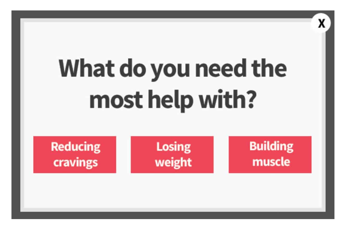
#24. Use a quiz
Quizzes are irresistible to the human psyche because they offer us a glimpse into who we really are.
We’re all on a journey of self-discovery, and that’s exactly what a quiz offers – self-discovery.
Here’s an example from the website of wealth guru Ramit Sethi:
#25. Make them smile
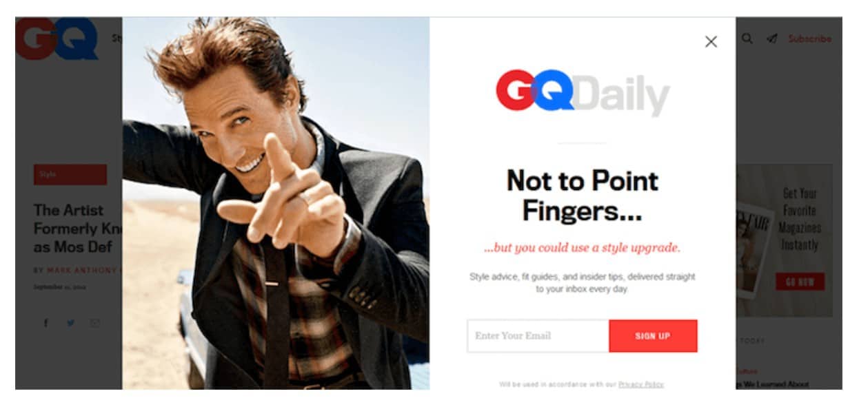
Humor is universal – if you can strike the right note (not easy to do) it will appeal to virtually everyone. This exit intent from GQ Daily is a good example:
#26. Ask their opinion
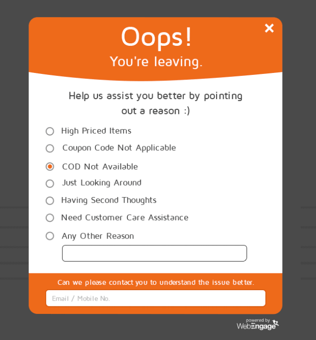
People like being asked what they think about something, so turn your exit intent popup into a brief survey.
For an e-commerce site the survey could be about the visitor’s customer experience:
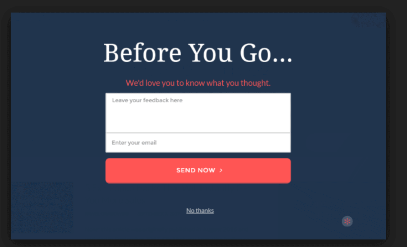
Alternatively, the survey could be completely open-ended:
#27. Deal with abandonment
The most common use of an exit intent popup is to collect email addresses.
But there are plenty of other applications for an exit intent popup.
Here are some other uses for your exit intent popup:
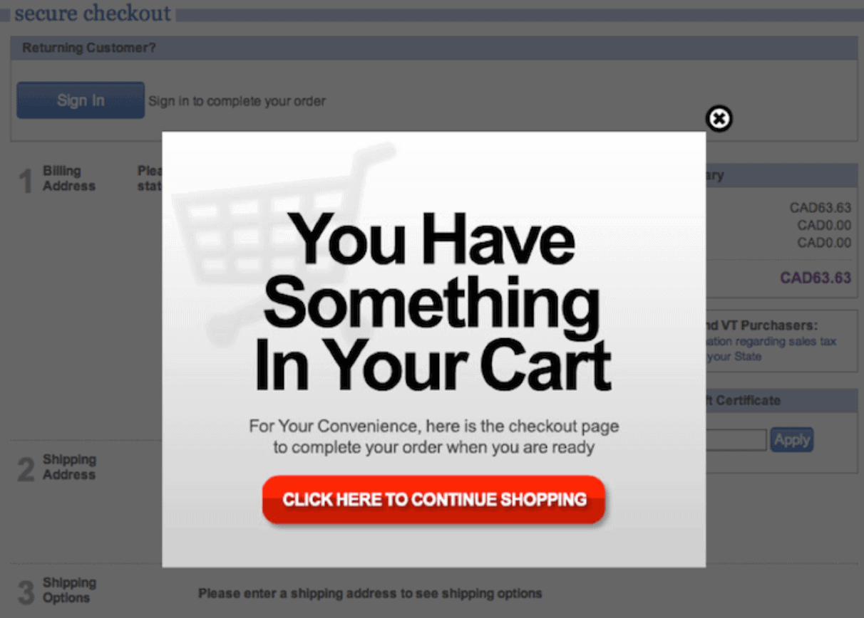
About three out of every four online shoppers leave their items behind in their shopping cart.
But you can reduce that statistic by reminding your potential customers with an exit intent popup like this one:
#28. Use limited time offers
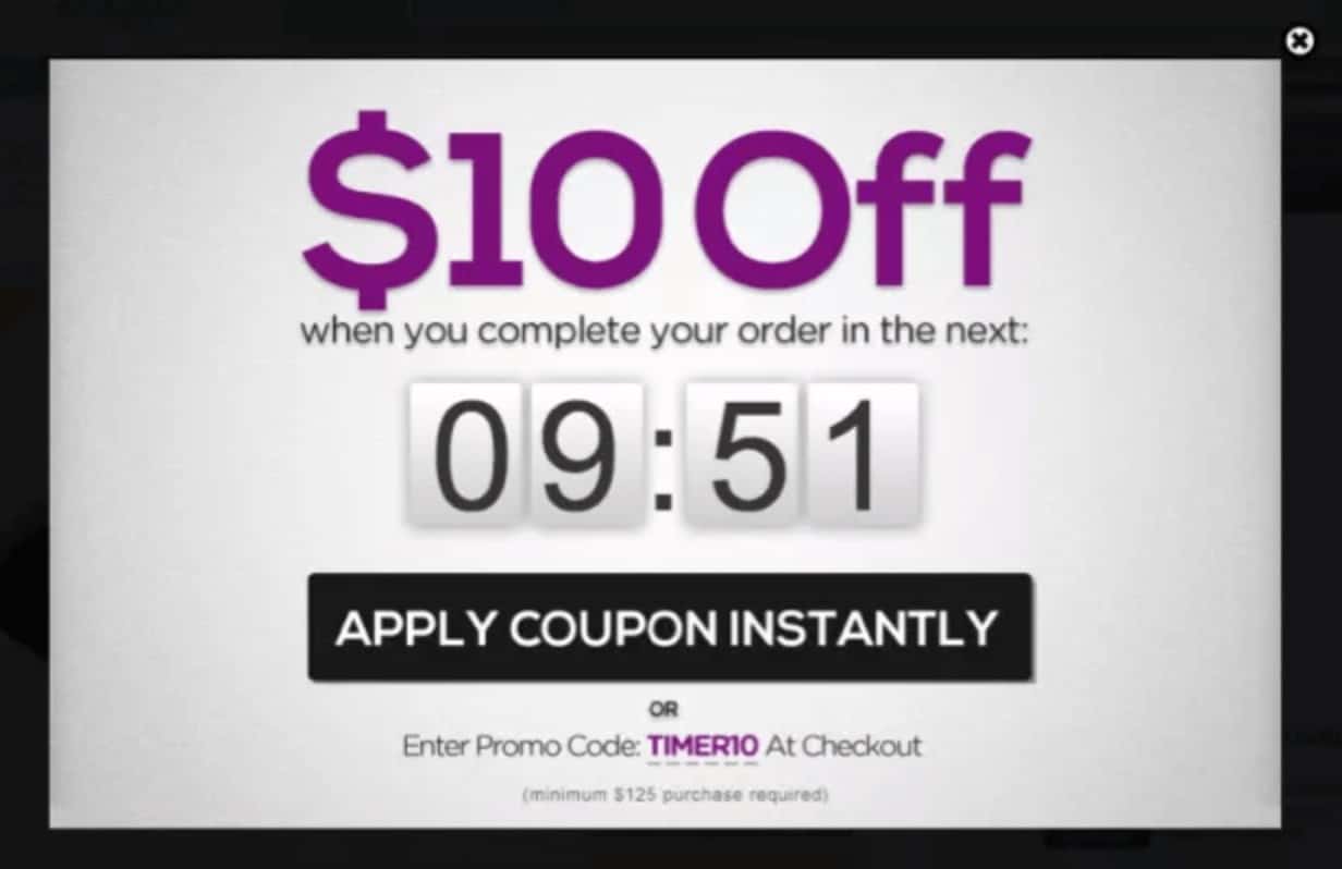
According to Hubspot, limited-time offers outperform ordinary sales copy by 8%. So, this is a great way to boost your sales:
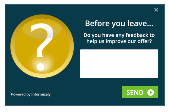
#29. Gather feedback
Collecting customer feedback not only helps improve products and services, it also shows you value your customers’ opinions. So, this is another great use of an exit intent popup:
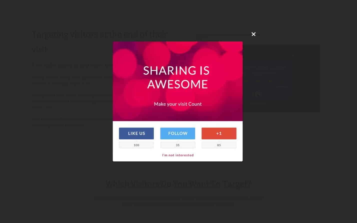
#30. Get social media follows
If your visitor is leaving anyway, why not try and get them to follow you on Facebook or Twitter?
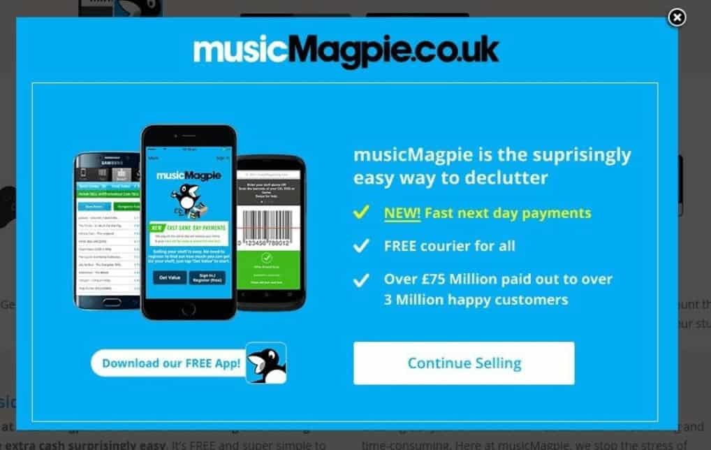
#31. Encourage app downloads
Got a free app that you need to get out there?
An exit intent popup is the perfect way to get more downloads:
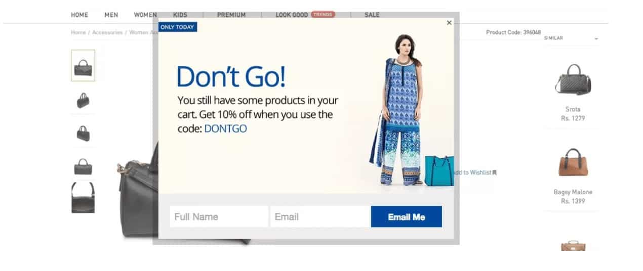
#32. Offer discount coupons
This is pretty simple – everyone loves a discount.
If your visitor is leaving anyway, why not make not make one last attempt with a discount coupon?
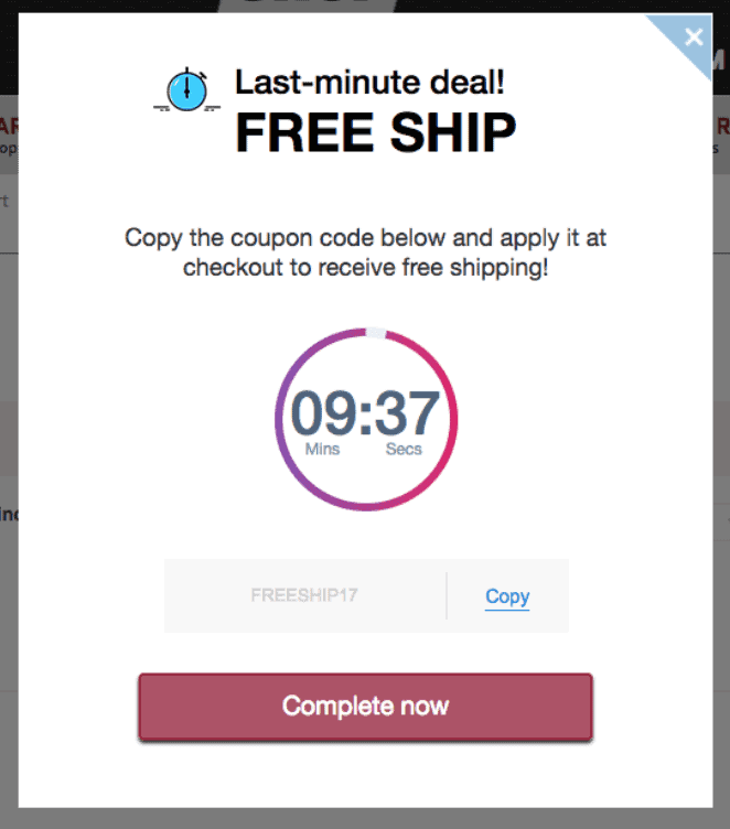
#33. Offer free shipping
According to a 2017 study by Walker Sands, 80% of US online shoppers say free shipping is a contributing factor to their online purchases.
So, if your visitor is leaving anyway, so why not offer free shipping?
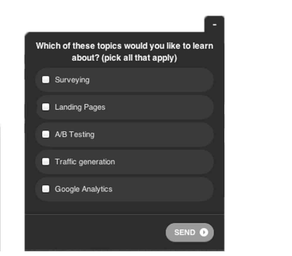
#34. Do a survey
Studies have shown that surveys get the best response when they take the form of multiple choice (rather than open-ended questions like “what could we improve?”):
#35. Suggest related posts
One perfectly valid use of an exit intent popup is to keep visitors on your site a bit longer. That will reduce your bounce rate and increase your ‘time on site’ (Google watches and measures both these metrics).
One way to keep people on your site longer is to recommend related posts. If your visitor just spent 15 minutes reading a post on building backlinks, they might also be interested in reading a post about guest blogging (which is a link building technique).
For this, however, you would need to target your exit intent popups to particular pages. See Exit Intent Hack #17 for instructions on how to do this in OptinMonster.
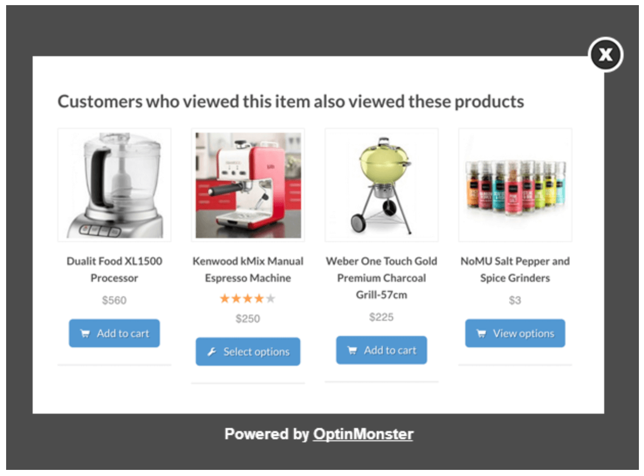
#36. Display related products or services
You’ve probably seen this technique at work in the Kindle Store – “customers who viewed this item also viewed these items”.
Like the ‘related posts’ technique, it’s a way of keeping your visitor on your website a bit longer by offering them something you know they’re interested in:
#37. Use A/B testing
Of course, the best way to discover a high-converting exit intent popup is to run an A/B test.
Create two popups that you’ve optimized in terms of design, message, and Calls To Action and then run them against each other.
Most major popup providers include split or A/B testing.
In OptinMonster, click on the three vertical dots next to the name of your campaign (i.e. your exit intent popup) and then click on ‘A/B Split Test’:

On the next screen, click on the A/B button:

You now have two versions of that exit intent popup:

Click on the ‘Edit’ button for the second of the two duplicates and rename it:
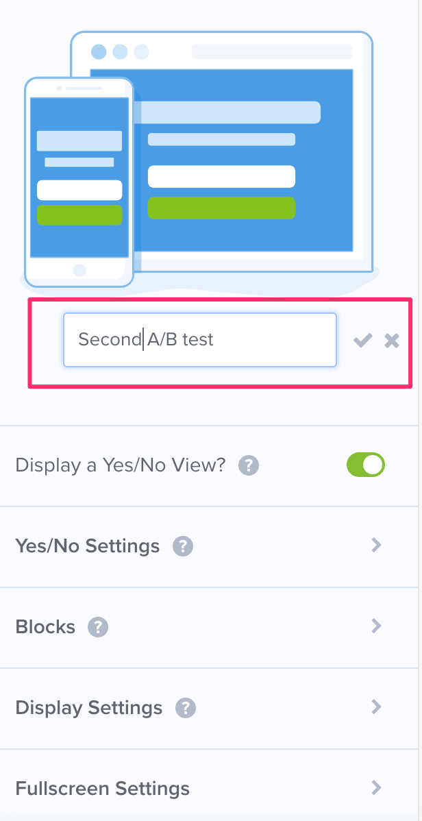
Now start making changes (headline, color of the CTA button, type of image etc.) to the second of the two duplicates.
OptinMonster will now randomly run the two variations and will automatically pick the winner.
Once you have a winner, repeat the process, until you have anew winner. And so. If you keep doing this, you’ll end up with a high converting exit intent popup.
#38. Use referrer detection technology
Referrer detection tracks sources of web traffic.
This tool detects when visitors land on your website from specific domains and lets you target those specific visitors with a message that matches their interests.
For more on how to use referrer detection technology in your popups, see this article by OptinMonster.
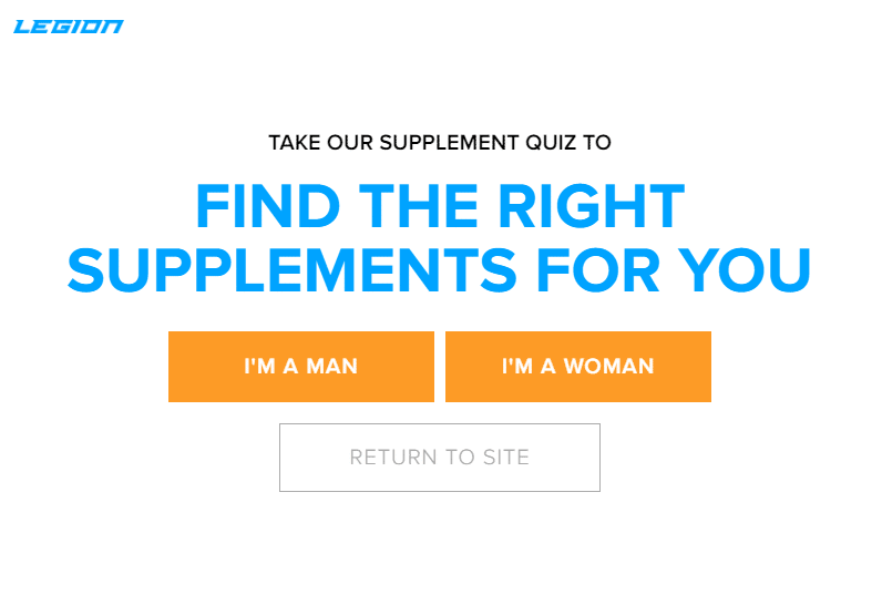
#39. Give your visitors some choices
One way to get more sign-ups is to make your visitors actively engaged with your website. And an easy way to do that is to offer your visitors some choices on your popup form.
Numerous studies have shown that getting people to make one step, however small, makes it more likely that they will complete the next step.
And that’s why when your visitor chooses between two or three buttons, they are more likely to complete the sign-up process.
Exit Intent Popup Providers
There are literally dozens of exit intent popup providers.
I use Thrive Leads. What I like about Thrive Leads is that it seamlessly integrates with the other Thrive Themes products I use (Thrive Architect, Thrive Ultimatum, Thrive Ovation).
Also, it has a very good A/B testing function. When I create an opt-in form, I make a cloned copy of it, and then change one element in the cloned copy (the CTA on the button, the headline, the background color, etc).
Then I run the two variants against each other to see which has the higher click-through rate (CTR). I set Thrive Leads to choose the winner automatically, so I don’t even have to bother with that!
And then just rinse and repeat: clone the winner and run another split test. By doing this, you end end up with some very high converting opt-in forms.
- Elementor Pro (includes Popup Builder) – $59 per year
- Thrive Leads (included in Thrive Suite) – $90 per quarter
- OptinMonster – starts at $19 p/month
- Bloom – $89 yearly membership (includes many other plugins and themes)
- Sumome List Builder – starts at $29 p/month
- Ninja Popups – One-time fee of $26
- Popup Domination – starts at $9 p/month
- WisePops – starts at $41 p/month
Conclusion
In this definitive guide to exit intent popups, this is what we’ve covered:
- The four key elements of a successful exit intent popup
- How to optimize exit intent popups to get more subscribers
- How to use them for other purposes (other than list-building)
- Some of the main exit intent popup providers
Armed with this information, you should be able to turbo-charge your exit intent popups and start getting more subscribers to your list.
More Articles About Email Marketing
- How Email Marketing Works in 2022 – The Definitive Guide
- 10 Best Email Marketing Services & How To Choose
- How To Use ConvertKit – 11 Useful Features You Need To Know
- 21 Headline Analyzers For Better Click-Through Rate (CTR)
- How To Build Your List on Medium & Grow Your List Fast
- How To Deliver Content Upgrades For Free In 7 Easy Steps
- 10 Best Lead Capture Tools For List Building in 2022
- Best Lead Magnet Delivery Techniques in 2022
hi. pls suggest free exit intent popups without the “powered by ..” branding. thanks.
Hi Meghna, I did a quick search and couldn’t find any free exit-intent popups that are not branded. I think that’s the trade-off: you get the free popup and they get the free advertising. Sorry I couldn’t help – Rob.